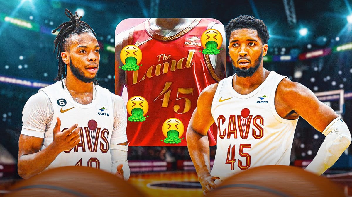
Ever since the NBA switched to Nike as its official jersey outfitter, there have been annual changes to a team’s jersey selection for a certain year. Now some, like Kyle Kuzma, have pushed back on this, but this is basically an opportunity for teams to expand their aesthetic range and creatively express themselves in a manner that would endear themselves more to fans. But this may be the exact opposite of what the Cleveland Cavaliers did when they unveiled their 2023-24 City Edition jerseys in front of their season-ticket holders.
Trying to drum up interest in the new jerseys, some officials were even saying before the official unveiling that they were excited to show fans the design they came up with. Suffice to say, Cavs fans did not like what they saw one bit. Unveiled behind the curtain was a Cavs jersey with its signature wine color and gold trim on the sides, which sounds very much on-brand. But instead of going with “CLEVELAND” as the primary jersey text, they went with “THE LAND” using a cheesy font that completes the entire corny ensemble.
This did not sit well with Cavs fans; one, in particular, even shouted out loud that he thought that those jerseys were garbage.
“That sucks. That’s garbage. Oh my god. What the hell was that?” one fan exclaimed.
"That sucks. That's garbage. Oh my god. What the hell was that?"
There was mixed reaction from Cavs season ticket holders as the team revealed their 2023-24 City Edition Jersey 😅
(via @evan_morgano)pic.twitter.com/V4RXicqB93
— ClutchPoints (@ClutchPoints) October 18, 2023
Instead of unveiling the new uniform to thunderous applause, Cavs fans in the auditorium had more of an audible exasperation as to why the team decided to push through with this design. Some were applauding, but that enthusiasm felt forced, as if fans were just being polite enough to at least give the officials some semblance of the reception they expected.
Fans on Twitter (X) echoed these statements pretty much, with one fan even calling the jersey “hideous“, “terrible“, and saying that those uniforms “stink“.
Is it too late to recall these jerseys from the store and start from scratch? Perhaps. But it’s clear that the Cavs and the Nike design team in charge of this abomination of a jersey have to go back to the drawing board in preparation for next season.
